
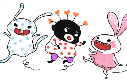
From Stina Wirsén's Lilla skär och alla de brokiga
Our Imagology course is continuing and at the same time Nordic media currently resound with debates that might be highly relevant to it. A couple of days ago the headlines in Sweden were about the decision, withdrawn within a couple of hours, to remove all Tintin albums from display for children at the ”Kulturhuset” (see previous post). There has also been a long discussion about the children’s books series about Lilla Skär (Little Pink) by the Swedish cartoonist Stina Wirsén. It started when a local section of Folkets Bio (a network of progressive movie theaters) chose not to show the new filmed version. The whole reason for that controversy is the little dark figure in the middle of this picture – her name is Lilla Hjärtat (Little Heart) and Stina Wirsén has told in an interview that her African friends were actually quite pleased with it.
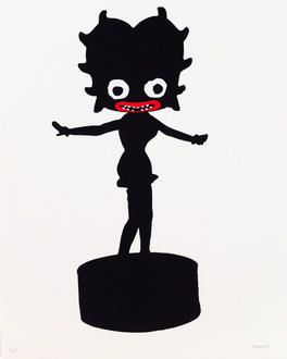
Betty Boop as blackface according to Makode Linde (litograph 2012) http://konstochfolk.se/graphic_s.aspx?art_ID=119&work_ID=1260
Others have loudly made their opinion known – occording to them Lilla Hjärtat is a typical blackface character, they say, a direct heir to the white actors with grotesquely painted black faces who used to do the ”niggers” in early American movies. If we look into the modern history of children cartoons and animations, the blackface is everywhere – from Winsor McCay’s Little Nemo (1908) to Donald Duck and Tintin of the Thirties and onwards, right up to some anti-Obama comics circulated in the Tea Party-movement in recent years. In the Sixties, underground cartoonist Robert Crumb started to make parodies of this common stereotype, as did the Afro-Swede Makode Linde at Moderna Museet in Stockholm half a year ago. To say that this stereotype is politically charged and controversial is almost an understatement.

Jeff Werner (arthistory.su.se)
But is it really the picture as such which is the problem? My Swedish colleague Jeff Werner at Stockholm University quickly wrote a comment in which he claims that both Stina Wirsén and those who defend her, like the journalist Sverker Lenas, are being naive in thinking that one can comprehend the full consquences of a picture by just looking at it. It is naive, he says, to use a stereotype without a good knowledge of its history and of the contexts in which it has been used, and therefore Image history and interpretation should be a mandatory subject in School (maybe also as Imagology?). I guess most of us who teach art history and image history are ready too agree with him on this matter. But then he also makes another claim – he says that an intelligent approch in analyzing an image is to find out not what it is but what it does. By this he seems to imply that we should not allow Wirsén and others to circulate their stereotypes without control, because neither the cartoonist nor her supporters can predict what the image will do in the long run.

A very active image... (Cartoon by Grandville)
The more I look at Werner’s sentences, the more I realize that they are a typical example of someone saying something which is supposed to sound smart, but which on closer inspection means absolutely nothing. Is the issue really ”not what the image is but what it does”? Well, then I guess you must assume that the image mysteriously has a life of its own rather than being a number of colored fields on a piece of paper (or similarly). That the image is animated, like certain holy images once were believed to be. What then comes to my mind is the British sociologist Janet Wolff and her sharp criticism of this kind of animism at a summer school here at ÅA in 2010 – up for scrutiny were such influential figures as W.J.T. Mitchell and James Elkins (and his The Image Stares Back). I appreciated this criticism very much. It was timely.
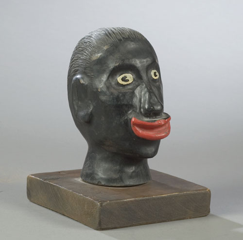
Racist
As a scholar in semiotics, my own candidate for the most urgent question is not ”what the image does” but rather what we do with the image, including what the artist does when she makes her choices. This is a question of semiotics, but also of visual rhetorics. Rhetorics is all about choices and a lot about stereotypes. I think what Anthony Johnson has said recently in our Imagology course could support a semiotic argument as well. One of the most important distinctions he has made is that between types and stereotypes – stereotypes being essentially something which is repeated, just like the printing cast from which the term originally came. The black color of the blackfaces is identically repeated, and therefore it is a stereotype. In terms of rhetorics, the stereotype is a choice, and in being a choice it is an action. The type, by contast, is not an action but a mental construct or cognitive pattern. Such types make it possible for us to imagine, for example, trees as a single concept in spite of the fact that there is a wide variation of trees.
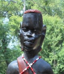
Not racist
In contradistinction to a simplification of matters à la Jeff Werner, I would say that increased historical knowledge will not make the racist dimension of Wirséns Lilla Hjärtat character more obvious, but rather less so. Especially if historical knowledge is combined with a semiotic understanding of different levels of ”abstraction” (or, with a more precise term, typification) in images. My basic argument for this is simple: imagine a highly abstract drawing of a human face, for example Wirséns Lilla Hjärtat, or Betty Boop by Macode Linde. Take away the black color – what would then remain of racial features? Simply nothing. The style is so simplified that depiction of racial features is impossible, except by means of exaggerated color. Then take the first wooden head in this post. I have marked it as ”racist” because it comes from an Internet auction where the seller explitly descibes it as a specimen of racist North American folkart. It is from about the same time as the blackfaces of American movies. Take away all painted color here – what would remain? A rather neutral wooden head, albeit with strangely exaggerated lips. A bit like Lilla Hjärtat without black color.
Then look at the second wooden head, taken from another Internet auction, and probably a tourist souvenir. Made by an african artisan, it has some traits of traditional tribal art, the dark color is the color of the wood, and from a naturalistic point of view the features are neither less nor more distorted than those of the previous head. If we would discuss which of the heads is the most ”negroid” one we would most probably never reach a conclusion.
I guess that my point with this demonstration is now clear – the racism of a picture has nothing whatsoever to do with some likness between picture and reality – it has to do with a choice of a certain stereotype in a certain context. In other contexts, the stereotype may rather serve as a means of silhouetting as imagologists say – i.e. of making an identity stand out ”in silhouette” against another identity. There is much more I could say about this, but I would like to save that ”powder” for a later occasion.
länkning pågår till intressant.se
![[Valid RSS]](valid-rss-rogers.png)