This text was first written in Swedish as an introduction to this recent article in the Finland-Swedish cultural review Ny Tid (for those of you who read Swedish), but it came to grow into almost an article of its own. I have here translated it into English as a preparation for the first lecture in the course “Comics” which I will give next Friday.
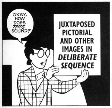
McCloud showing his definition of "comics" in his own comic "Understanding Comics" (1993)
For a long time picture stories or comics were regarded as an entertainment for children and the illiterate – as bad pictures and stupid words, printed on cheap paper. The American regulation of content in comics – established in the 1950ies by The Comics Code Authority – had parallels in European countries too. The idea that within less than half a century comics would be recognized as an art and subject to learned academic analyses would at that time have seemed ridiculous to most serious intellectuals. One may compare this Western “comico-phobia” with a culture such as the Japanese, traditionally characterized by a quite different attitude towards the interaction between images and words.
It is not just so that some written characters in Japanese – those called kanji – have their origin in pictorial signs. It is also a fact that the Japanese painter and author – in the role of poet, chronicler or reporter – used to be united in the very same person. Pictures and words were indeed written on the same sheet or roll and with the same tools – it was a matter of written pictures and painted words. We know that there was a marked difference between the meditative ink painting of the educated classes and the more casual woodblock prints in colour – called Ukiyo-e (“floating world”) that were disseminated widely and cheaply for the main audience. But later, when the Western idea of a literary genre and academic subject called Art History was introduced in the East, popular woodcut artists like Hokusai and Hiroshige were the ones who were hailed for representing something uniquely Japanese. Today their pictures are often considered to be the origin of manga comics and anime. Indeed, Manga (sketches) was the title of a famous series of drawings of everyday life by Hokusai.
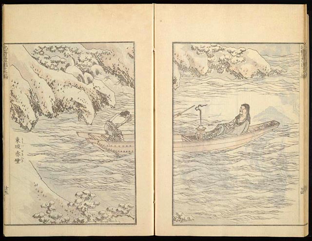
A spread from Hokusai's "Manga". Similar multi-panel renderings of the same scene can be found in many comics today.
In the East as well as the West comics is today a major and expanding medium with a lot of genres and sub genres – children’s comics, teenage comics, adult comics, Fantasy comics, Zombie comics, Apocalyptic comics, Experimental comics, etc. Comics research is beginning to develop into a separate academic field with concepts and theories primarily drawn from Comparative literature, Communication studies and Sociology. It is however a field in which the practitioners still tamper with the legitimacy and identity of their role. Most scholars in the field are themselves fans, and this creates a risk of hagiography with a lack of critical distance – people paying homage to their favorite artist without posing important theoretical questions.
All new fields are initially created by enthusiasts who are often amateurs and not part of academic networks. It is significant that the first really influential (i.e. Anglophone) theories of how comics work on the visual level were written by individuals who were themselves distinguished comics artist, but certainly not scholars. The individuals I have in mind are Will Eisner and Scott McCloud. Will Eisner (creator of The Spirit) drew and wrote his theory Comics and Sequential Art that was first published in 1985. Scott McCloud (the Zot! Superhero series) is a fan of Eisner and expanded the definition of comics as “sequential art” in his 1993 Understanding Comics: The Invisible Art. McClouds work is something as decidedly un-academic as a theory of comics done as a comic book. I won’t say that there is anything wrong in that – his form of presentation is innovative and pedagogical. But in McClouds theory there are numerous strange claims that show that his intuitive method has certain limitations. For example, he seems quite convinced that the unique thing about comics is that they put forward a certain type of words and images – i.e. simple words and simple images.
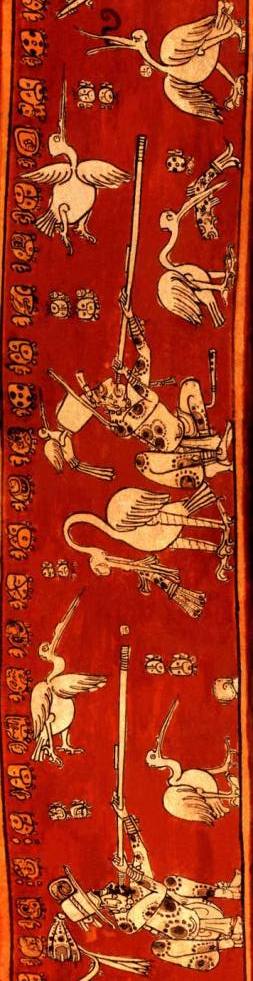
Detail of the famous "K4151" Mayan vase with a "comic" of a hunter shooting a bird in the neck, capturing the backward movement of the bird when it dies.
Already in Old Egypt or in the pre-Columbian Maya culture in Mexico there were predecessors to our own Comics, McCloud claims. In these old image cultures, human characters in pictures were not depictions of individuals, but rather signs for more abstract human types (such as slaves, warriors, princes, women). On the other hand, the written characters in manuscripts and reliefs had kept their old traits as image signs, or pictograms. In other words, pictures were abstract whilst writing was concrete. Starting with the 15th Century renaissance in Europe, things however changed dramatically. The pictures developed into wordless tabulae (framed paintings) depicting specific characters and things in a detailed, extremely concrete way. Words, on the other hand, were subordinated to abstract ideological discourses in novels and academic theses. The concrete pictures no longer needed many words, and the abstract texts were to an increasing extent printed without any pictures. The great wave of comics during the 20th Century seems however to be regarded by McCloud as a return to a more healthy way of communication, and he explicitly advocates the late Marshall McLuhan’s idea that “Gutenbergian” print culture is falling apart and giving way to images and electronic media. The typical comic, according to McCloud, again exemplifies an abstract and simplified picture in unity with brief words that either repeats or adds to the pictorial information.
However, when postulating this double simplicity as a general rule, McCloud has to ignore that it is definitely not to be found in all kinds of comics. There are comics in which pictures are highly naturalistic or even based on photographs (as in John J. Muth’s work) – which is something that McCloud indeed points out himself by means of a diagram at pages 52-53 in Understanding Comics. There are European experimental adult comics that can be really demanding in terms of the ability of reading large amounts of text – as for example Alan Moore’s and Bill Sienkiewiscz’ documentary album about the Contras scandal (Brought to Light, 1988). Furthermore, there are of course comics that don’t contain any kind of written replies or comments whatsoever – which is a somewhat trivial fact, but one which McCloud could have paid more attention to. He seems to take for granted that the defining characteristic of comics is the interaction between word and image. (There are also examples of comics with no pictorial images.)
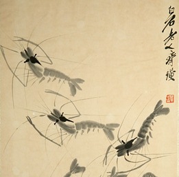
Shrimps. Detail of a painting by the Chinese master Qi Baishi (1864-1957).
If we look towards the East again, the animals and humans of traditional ink painting are definitely no abstract pictorial signs in the manner of Mickey Mouse or pre-Columbian writing systems. With just a few strokes and blotches of ink a skilled painter can create a picture that gives the impression of being more detailed than the result of several hours of trite work by an amateur, copying hairs and wrinkles. Neither would the content of a poem or a chronicle automatically be more concrete just because it is accompanied by a picture or written with ideographic signs such as kanji. As far as I have understood, not being a Sinologue, the meaning of every kanji is dependent on the associations that the general reader would make in connection to its basic reference. These associations can be highly abstract. It therefore seems that McCloud’s arguments are dependent on a European and an Anglo-American context, but as soon as they are tested against other cultural traditions they start to fall apart. His theory seems to be culturally myopic – indeed Eurocentric. The absence of dominating Western strategies for organizing space, picture and text is wrongly called “simplicity”.
länkning pågår till intressant.se